Image processing update
This update to mood.camera re-works part of the rendering pipeline to deliver greater consistency, improved tone mapping and colours. Some of these changes are subtle, but combined they deliver more refined look overall.
Dynamic Range
The most significant change in this update is a complete rework of the Dynamic Range processing.
I think Dynamic Range (or rather, the lack of it) is a fundamental part of the "film look". However, the previous implementation had several limitations:
- It relied on Apple’s RAW processor with only a simple 0–1 control, offering very little flexibility.
- Results were inconsistent, sometimes producing overly dark images or harsh highlight clipping.
- It wasn’t available on non-Pro iPhones or in Portrait mode.
- Because of these constraints, it couldn’t be integrated into preset settings.
To address this, I have reworked this part of the pipeline from the ground up. This was a pretty considerable task and required a lot of tuning to get it looking right plus working on all devices. However it gives far greater control over the tone mapping and in my opinion gives much more consistent and pleasing results.
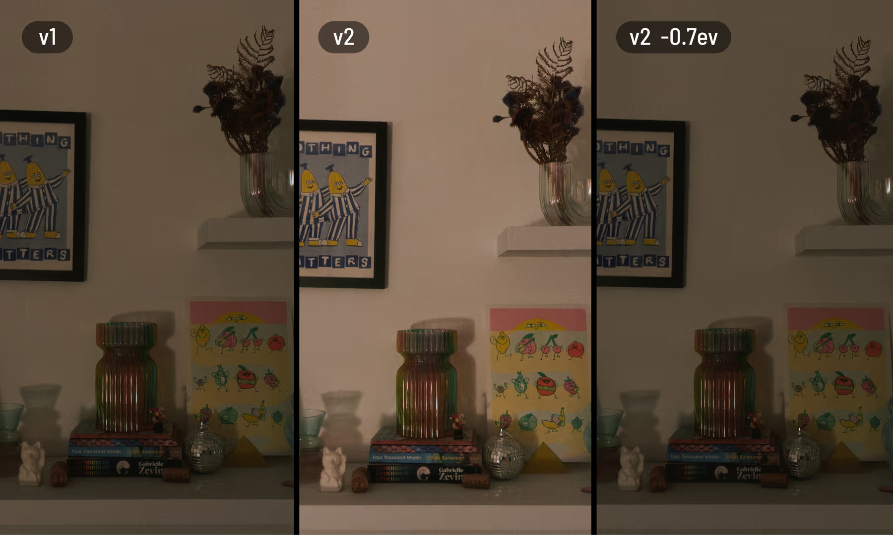
Overall the effect is more balanced than the previous iteration and is generally less extreme but it depends on the scenario. Here are some examples using DR Medium and Zero.
As you can see in the above example the old version would often under expose the image. Exposure behavior is now more consistent at lower Dynamic Range settings, and adjustments via Exposure Bias feel more predictable.
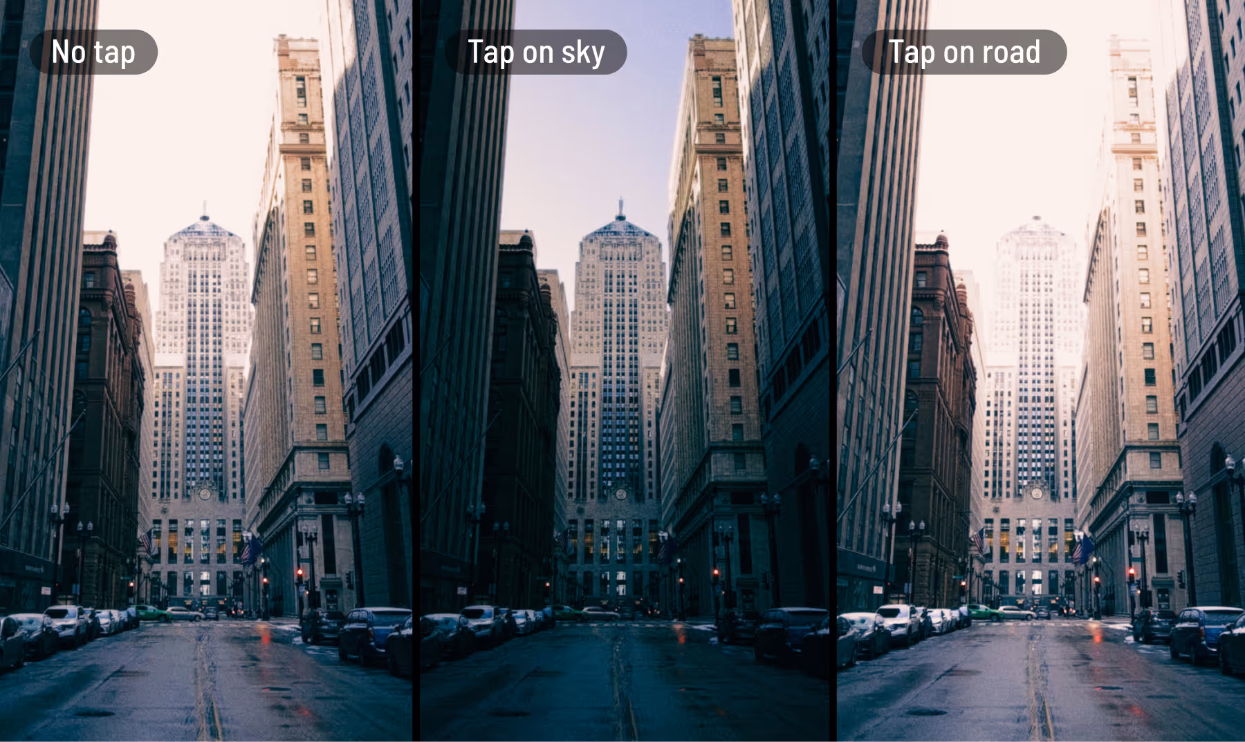
The updated version also takes into account where you tap to focus. Tapping a darker area preserves more shadow detail, while tapping a brighter area reduces blown highlights.
In testing, this has felt intuitive and gives pleasing results.
Colour saturation, density and contrast
Additionally in this update, I’ve refined how colour and contrast behave.
Saturation now works more like vibrance, having a stronger effect on less saturated colours while being more restrained with already vivid tones.
I’ve also introduced a subtle density effect inspired by film. As colours become more saturated, their brightness is gently reduced. This creates deeper, richer colours that retain detail and avoid a harsh, neon-like look.
Finally, I’ve slightly softened the contrast curve to reduce crushed blacks and harsh highlights. The change is subtle, but it helps preserve more tonal detail across the image.
Individually these adjustments are minor, but together they add another layer of character, moving further away from the typical “iPhone look.”
Unsharpening
In this release I also completely re-worked the unsharpening algorithm to better match the output from the ProRAW pipeline.
Other changes
Real iPhone photos in the filter preview - Thanks to all these changes I am able to include real images in the filter preview donated by users. This should help visualise how your photos will come out.
Updated Tone presets - The Tone settings have been updated to take advantage of the new Dynamic Range settings and have been tweaked accordingly.